9 Design Moves That Make Tiny Homes Look Expensive (Without the Price Tag)
Luxury tiny homes don't feel expensive because they're filled with rare materials—they feel expensive because they're edited. A tight palette, calm storage lines, and layered light that makes everything look intentional.
In a tiny home, every seam, hinge, and countertop corner sits in your field of view. That's why visual discipline reads as "high-end" faster than expensive materials. Here are 9 repeatable design moves you can copy—plus how TinyHouses AI helps you execute them without guesswork.
The Luxury Triangle for Tiny Spaces
Three principles create that "expensive" feel:
- Consistency: Fewer materials, repeated on purpose
- Calm: Concealed clutter, clean storage lines
- Glow: Ambient + task + accent lighting, ideally dimmed
When you design with TinyHouses AI, we lock these principles into your plan before you buy finishes—so you don't end up with a viral look that's impossible to keep tidy or cohesive.
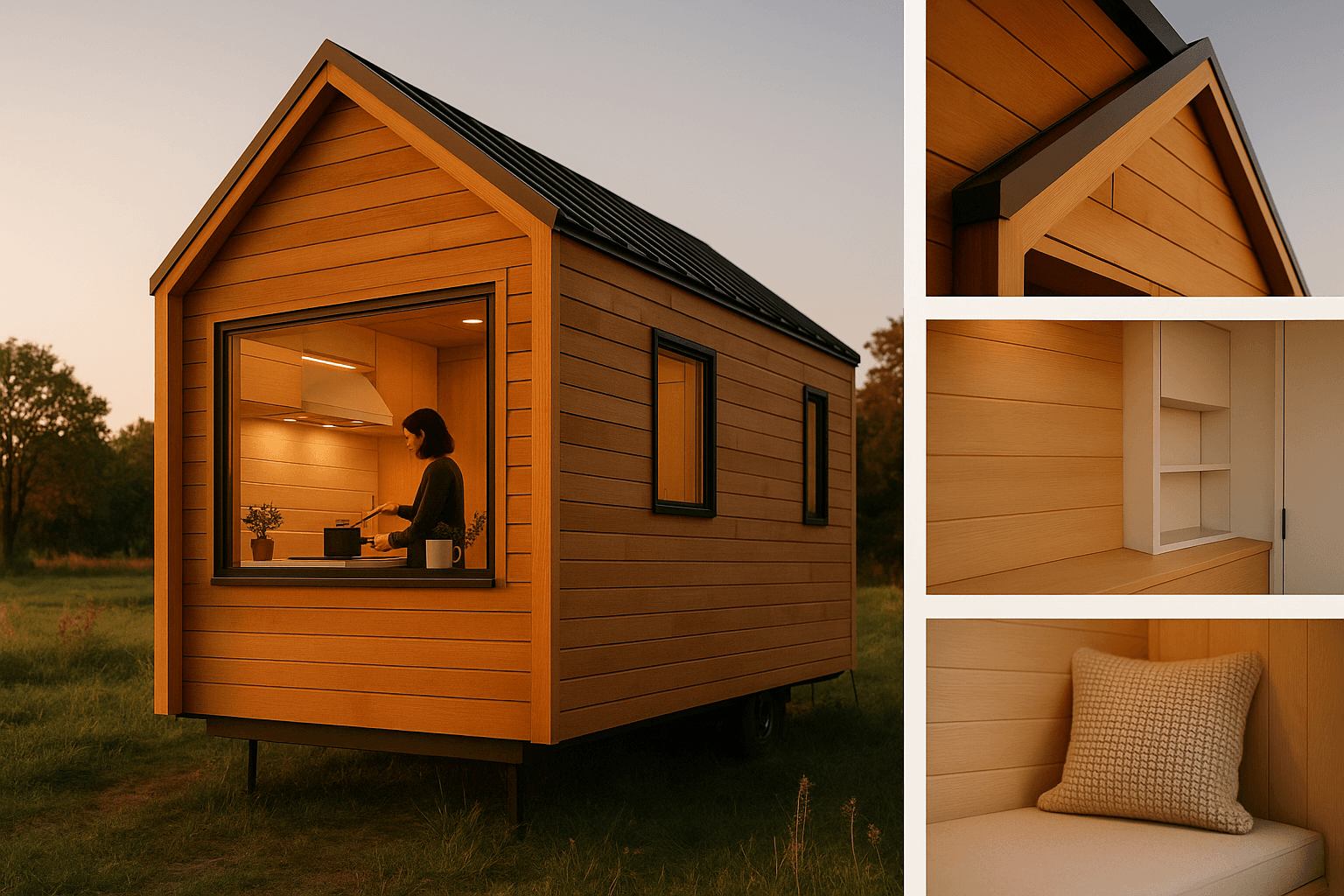
1. Master the 3-Material Rule
Luxury interiors look "expensive" because they look decided. In tiny homes, a cohesive palette prevents the patchwork effect that screams "budget."
The rule:
- 1 main wood tone (oak, walnut, bamboo—pick one)
- 1 metal finish (matte black or brushed nickel or brass)
- 1 solid surface family (countertop + bathroom surfaces)
Why it works: Fewer transitions mean fewer "budget tells." Repetition feels custom, not random.
Splurge vs Save:
- Splurge: One hero surface you touch daily (countertop or faucet)
- Save: Quality laminate that matches your wood tone consistently
TinyHouses shortcut: Upload a screenshot of a luxury tiny you love into TinyHouses AI. Ask it to extract a 3-material palette that's moisture-safe and weight-conscious for your build.
2. Layer Your Lighting Like a Boutique Hotel
Lighting is the #1 luxury multiplier—and the most common miss. A single bright ceiling fixture reads utilitarian. Layered light creates depth and softness.
The layers:
- Ambient: General light (recessed, pucks)
- Task: Work zones (kitchen, mirror, desk)
- Accent: Toe-kick, shelf wash, headboard glow
Stick to 2700K–3000K for that warm, hotel-like tone.
In your tiny:
- Put kitchen task lighting on its own switch
- Add under-cabinet or toe-kick lighting
- Use dimmers wherever possible
Splurge vs Save:
- Splurge: Dimmers + one statement fixture in key sightlines
- Save: LED strips in aluminum channels, simple pucks
TinyHouses shortcut: Generate a lighting plan by zone so your builder isn't improvising wiring.
3. Create Concealed Storage Lines
You don't see "stuff" in luxury spaces. You see clean planes.
What this means:
- Full-height cabinet doors where possible
- Consistent reveals and gaps
- Hidden utilities (router, trash, laundry)
Why it works: Fewer visual breaks feel more architectural. Clutter feels louder in small volumes.
Splurge vs Save:
- Splurge: Soft-close hinges on most-used doors
- Save: Standard boxes with upgraded fronts and pulls
Watch out: Open shelves become visual clutter fast unless you live like a stylist.
4. Upgrade What Your Hands Touch
If you want to feel luxury without paying luxury prices, upgrade your touchpoints:
- Door levers
- Cabinet pulls
- Faucets
- Switch plates
- Shower controls
Weight, finish, and tactile quality register instantly. Cheap glossy plastic is a dead giveaway.
The rule: Pick one metal finish and repeat it everywhere.
Splurge vs Save:
- Splurge: Faucet + main entry hardware (highest touch)
- Save: Same finish, simpler models elsewhere
5. Get Window Proportions Right
Luxury tiny homes don't have more glass—they have better composition.
What works:
- Fewer, larger windows
- Aligned heads and sills
- Consistent trim strategy
Why it reads luxury: Alignment looks intentional and "architect-designed," not DIY.
Your move: Choose one feature window moment (picture window at dining or bed). Keep other windows standard sizes but align them visually.
TinyHouses shortcut: Test window layouts on elevation views to ensure your "luxury" moment doesn't steal your storage space.
6. Add Floating and Shadow Details
Depth makes small spaces feel premium fast.
Create depth with:
- Toe-kick recesses
- Under-cabinet lighting
- Floating vanity or wall-hung nightstands
Shadow lines equal architectural detail. Floating moments feel custom.
In practice: Add a toe-kick recess in your main kitchen run. Use a darker toe-kick color for a "lifted" look.
7. Soften the Acoustics
Echo makes spaces feel cheap—even with beautiful finishes. Tiny homes have lots of hard surfaces close together, so acoustics matter more than you'd expect.
Add softness with:
- Area rugs
- Upholstered bench
- Curtains or textile panels
- Slatted wood with backing
Quiet feels expensive. Soft textures read "home," not "camper."
Your baseline: One rug in the main zone, one upholstered element, curtains near your largest window.
8. Build Intentional Storage Seating
Built-ins are luxury signals because they look designed for the space.
Think:
- Dining banquette with under-seat storage
- Window bench that doubles as gear storage
- Headboard with integrated ledges
Why it works: Looks architected, not furnished. Organizes clutter invisibly.
Nail the details: Get seat height and depth right—comfort is luxury.
9. Control Every Line and Seam
Luxury is often just clean execution.
Focus on:
- Continuous flooring where possible
- Fewer material transitions
- Consistent trim profiles
- Tidy caulk lines
Messy seams look like compromises. Fewer transitions make spaces feel larger and more designed.
The rule: Run one flooring through your main zone. Limit changes to wet areas or structural needs.
Your Luxury Tiny Cheat Sheet
| Focus Area | Splurge Here | Save Here |
|---|---|---|
| Lighting | Dimmers + hero fixture | Pucks + LED strips with diffusers |
| Touch Points | Faucet + door hardware | Same finish, simpler models |
| Windows | One picture window | Standard windows, aligned trim |
| Built-ins | Upholstery + comfort | Simple boxes, clean fronts |
| Acoustics | Quality rug + curtains | Washable textiles, DIY solutions |
| Finish Work | Visible seams + alignment | Simpler profiles, fewer transitions |
Copy This: TinyHouses AI Palette Generator
Paste this into TinyHouses AI Designer:
Design a "quiet luxury" tiny home palette for a [length] house with [modern/Japandi/Scandinavian] style. Constraints: durable, easy-clean, moisture-safe, weight-conscious for THOW, budget-conscious. Output: (1) 3-material rule palette, (2) wall + trim colors with sheen, (3) flooring, (4) lighting plan with 2700K–3000K fixtures by zone, (5) 5 "avoid" rules that make tiny interiors look cheap, (6) shopping checklist with splurge vs save notes.
Then ask: "Turn this into a builder-ready spec sheet."
Common Luxury Tiny Mistakes to Avoid
What makes tiny homes look "RV" instead of "luxury"? Busy finishes, visible clutter, harsh overhead lighting, and too many material transitions.
The biggest mistake? Multiple wood tones and mixed metals. Pick one direction and commit.
Open shelves? Only if you live like a gallery curator. Otherwise, they become visual clutter.
Lighting temperature? Stick to 2700K–3000K consistently. Mixed temperatures look messy instantly.
Ready to design your luxury tiny? TinyHouses AI turns these principles into buildable plans—from material palettes to lighting layouts to storage solutions that actually work for your lifestyle.