Open-Concept Tiny Houses: Why the 'Spacious' Layout Often Fails (and How to Fix It Without Walls)
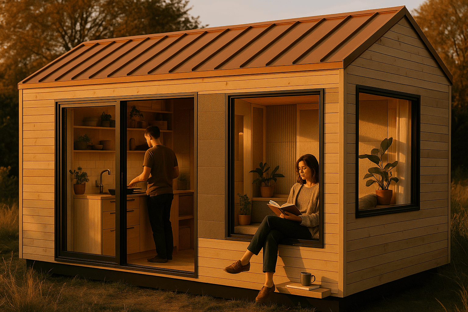
Open-concept can absolutely feel spacious and modern in a tiny house—but only if you design for three hidden requirements: concealment (mess has a home), sensory control (noise + light), and circulation (a clear path). Without those, "open" turns into a bright, echoey room where everything is visible and nothing feels calm.
Open-concept ≠ spacious in a tiny footprint
In a full-size home, removing walls often creates a genuine sense of scale. In a tiny house, removing walls can do the opposite because the space is already one volume.
In tiny houses, "spacious" comes from:
- Visual continuity (clean sightlines, not necessarily no partitions)
- Clear circulation (a path you don't have to "borrow" from furniture zones)
- Controlled clutter (closed storage where it counts)
- Comfortable sensory zoning (quiet + dim when you need it, bright + active when you want it)
How TinyHouses helps: Our AI designer lets you generate multiple "open" layouts that solve spaciousness like an operating system—not as a vibe. Compare a pure studio-open plan vs a broken-plan vs a flex-wall plan in minutes instead of discovering the flaws after you build.
Failure Mode #1: Nowhere to hide mess (the "visual noise tax")
Open layouts make tiny homes feel modern—until the kitchen, entry, and desk start broadcasting daily life. In a small footprint, a little mess becomes a lot of visual clutter because it's always in your main sightlines.
What causes it
- Kitchens create constant "micro-mess" (coffee gear, dishes, appliances)
- Remote work surfaces accumulate cables + papers
- Tiny homes often lack backstage zones (pantry, utility closet, coat closet)
Fix it without walls: design concealment volume first
A strong rule for tiny open-concept: plan closed storage equal to (or greater than) open shelving. Open shelves are beautiful in photos—but in daily living, closed storage is what keeps "open" feeling calm.
High-impact concealment upgrades (modern-looking, not bulky):
- Closed storage at eye level (the clutter you see matters more than what's low)
- Appliance garage (a single door that hides toaster/espresso/blender)
- Pull-out pantry (tall + narrow beats wide + shallow in tiny kitchens)
- Toe-kick drawers (hidden storage that doesn't add visual mass)
- Entry "drop zone" (a slim cabinet or drawer bench to stop pile-ups)
The stealth move: half-height storage to block the mess sightline
Instead of a wall, use a 42–54 in (107–137 cm) high storage unit to:
- Hide countertop clutter from the sofa/bed
- Create a psychological "room edge"
- Keep light and openness flowing above
TinyHouses workflow tip: In the AI designer, tell us what you want hidden (e.g., "hide kitchen counters from lounge and bed sightlines") and generate 3 variants that place the divider differently—near entry, mid-house, or as a kitchen peninsula.
Failure Mode #2: Noise + lighting conflicts (comfort breaks first)
In an open tiny house, different activities collide:
- Sleep vs cooking
- Work calls vs TV
- Early riser vs night owl
Because surfaces are often hard (plywood, drywall, LVP, glass), sound bounces. Lofts amplify it further because distances are short and reflections stack.
Fix it without walls: build "softness" into the modern aesthetic
You don't need a cabin look to reduce echo. You need absorption placed intentionally.
Acoustic softening checklist:
- Area rug (biggest impact per dollar; reduces footfall + echo)
- Curtains (even modern ripple-fold curtains soften glass reflections)
- Upholstered seating (fabric absorbs; leather reflects more)
- Felt/cork wall panels (thin, modern, and effective—great behind a desk)
- Fabric closet fronts or curtain-backed storage (soft "surfaces" that double as concealment)
- Acoustic ceiling panels (if your tiny house is a sound box, the ceiling is the best place to treat without adding visual clutter)
"Quiet corner" strategy: position sensitive zones thoughtfully
In a tiny footprint, you often can't isolate a room—but you can position your most sensitive zone.
Place your quiet zone:
- Farther from kitchen appliances
- Not directly under a loft ladder/steps
- Not facing the TV line-of-sight
Lighting: open plan needs layers, not one bright ceiling light
A single central fixture makes everything feel like one zone—and it's often harsh.
Layered lighting that keeps it modern:
- Ambient: indirect LED strip or wall wash to make the volume feel larger
- Task: under-cabinet lighting, desk light, reading sconces
- Low-glare night path: toe-kick LEDs or low wall lights so one person can move without waking the other
- Dimmers everywhere (tiny homes change use by hour)
TinyHouses workflow tip: Ask the AI designer for "night lighting path that doesn't light the whole home" and "acoustic soft surfaces included in a modern palette." You'll get layouts where lighting and material choices are part of the plan—not an afterthought.
Failure Mode #3: No defined circulation (the tunnel effect)
On a Tiny House on Wheels (THOW), the width constraint often produces a long, narrow interior. If you don't design circulation first, the home becomes:
- A tunnel lined with furniture
- A squeeze-point near the kitchen
- A constant "shuffle" around chairs, ladder, and doors
Clearance targets that keep an open tiny house feeling easy
| Area | Comfortable Target | Why it matters in open plans |
|---|---|---|
| Main walkway | 30–36 in (76–91 cm) | Prevents the "obstacle course" feeling |
| Galley kitchen aisle | ~36 in (91 cm) | Lets two people pass or cook without friction |
| In front of cabinets/appliances | ~36 in (91 cm) | Doors/drawers need swing/stand space |
Fix it without walls: design a circulation spine
Start by drawing one clear route from entry → living → kitchen → bath/bed.
Then protect it:
- Keep dining/desk chairs from spilling into the path (use bench seating or tuck-under stools)
- Align furniture edges parallel to the spine
- Put the ladder/steps where they don't pinch the kitchen zone
Use ceiling + lighting to "draw" the route
You can make circulation feel intuitive without partitions:
- A soffit over kitchen/bath can visually compress service zones
- A clean, taller ceiling plane over living makes that zone feel bigger by contrast
- A linear light can guide the path and create intentionality
The "no walls" toolkit: keep the open look, add privacy + calm
These are the fixes that preserve modern openness while adding real-life function.
1) Micro-zoning (the "broken plan" approach)
A broken plan is open-concept with subtle boundaries.
Micro-zoning tools that stay modern:
- Built-ins that create edges (banquette, desk wall, storage block)
- Flooring shifts (only if it doesn't visually chop the home—use tone-on-tone)
- Ceiling shifts (soffit over kitchen/bath, clean ceiling over living)
- Lighting zones (separate circuits per area)
2) Half-height storage dividers (the tiny-house hero)
Use 42–54 in high storage to:
- Hide mess
- Create a "room feel" without darkness
- Add real capacity in a home that can't waste volume
3) Sliding partitions / pocket doors / curtains (privacy on demand)
| Partition type | Best for | Why it works in tiny homes | Watch-outs |
|---|---|---|---|
| Sliding panel | Bedroom/office privacy, frequent use | Doesn't steal swing space | Needs wall length to slide along |
| Pocket door | Bathroom/bedroom when you want a clean look | Disappears completely | More complex build; wall must be designed for it |
| Curtain track | Budget + flexibility, soft acoustics | Adds softness + quick zoning | Less sound blocking; choose quality fabric |
| Slatted screen | Modern visual separation | Keeps light flow, hides clutter angles | Doesn't stop noise much |
4) Sightline management (what you see from the entry)
"Spacious" starts at the first glance.
From your front door, aim to see:
- Window/light
- The cleanest wall
- Living zone—not the sink, dishes, or laundry
A half-height divider, slatted screen, or cabinet can redirect that first view and instantly make the home feel larger.
Three AI layout styles to compare (pick your kind of "open")
There isn't one perfect open concept—there are three that work for different lifestyles. On TinyHouses, you can generate all three and compare the trade-offs before committing.
1) Studio-Open (maximum visual continuity)
Best for: solo living, minimalist couples, people who keep surfaces clear.
Must be true for it to work:
- High closed-storage ratio
- Acoustic softening (rug/curtains/panels)
- Layered lighting so it doesn't feel like one bright box
Generate it in TinyHouses: ask for "studio-open, modern, hidden storage focus, calm sightlines from entry."
2) Broken Plan (micro-zones without closing the space)
Best for: couples, light WFH, people who want open living but calmer edges.
Key ingredients:
- Half-height divider or built-in (banquette/desk block)
- Ceiling or lighting shift over service zones
- Defined circulation spine
Generate it in TinyHouses: ask for "broken plan micro-zones, half-height storage divider, define living vs kitchen vs work area."
3) Flex Wall (open most of the day, private when needed)
Best for: remote workers, frequent guests, families, anyone needing a real retreat.
Key ingredients:
- Sliding panel / pocket door / curtain wall that creates a bedroom-office mode
- Quiet corner desk placement
- Night lighting path for different sleep schedules
Generate it in TinyHouses: ask for "flex wall: sliding partition to create private bedroom/office, acoustic comfort for calls, modern minimal look."
Quick decision guide
- If you hate visual clutter → Broken Plan or Flex Wall
- If you take daily calls → Flex Wall
- If you want the most "modern loft" feel → Studio-Open (but only with serious concealment)
- If you cook a lot → Broken Plan (hide kitchen mess + control sound)
How to design your open tiny house in TinyHouses
Most open-concept tiny houses fail because they commit to a single layout too early. The smarter move is to compare 2–3 philosophies against your real life.
A simple TinyHouses design workflow
- Set your priorities (privacy level, WFH frequency, hosting, storage needs, sleep sensitivity)
- Generate three variants: Studio-Open, Broken Plan, Flex Wall
- Score each on:
- Mess concealment (how fast can it look clean?)
- Acoustic comfort (can someone work while someone cooks/TV?)
- Circulation clarity (does the walkway stay open when chairs are in use?)
- Then explore rentals/buys in the TinyHouses marketplace that match the layout style you chose
Design your open-concept tiny house with TinyHouses AI. Generate studio-open, broken plan, or flex wall layouts and compare them before you build. Start designing →